Typographic clues
PROP
Note
FUNCTION
Causal
DESIGNER
Unknown
TV SHOW
High Potential
YEAR
2024 – Present
DIRECTOR
Todd Harthan, Rob Thomas
PRODUCTION DESIGNER
Valerie Green, Matthew Budgeon
GRAPHIC ARTISTS
Jamie Phanekham, Liz Ritenour
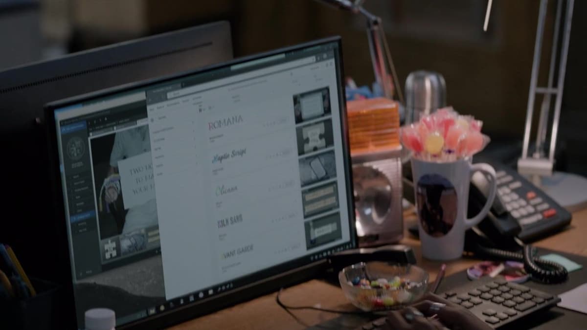
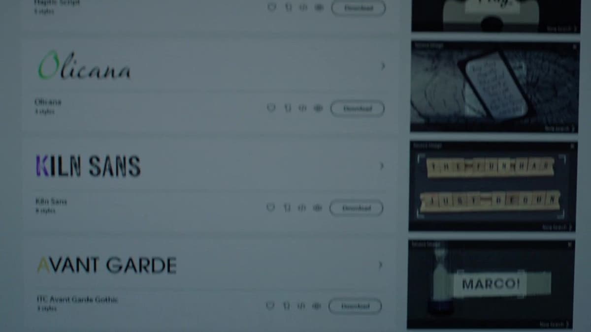
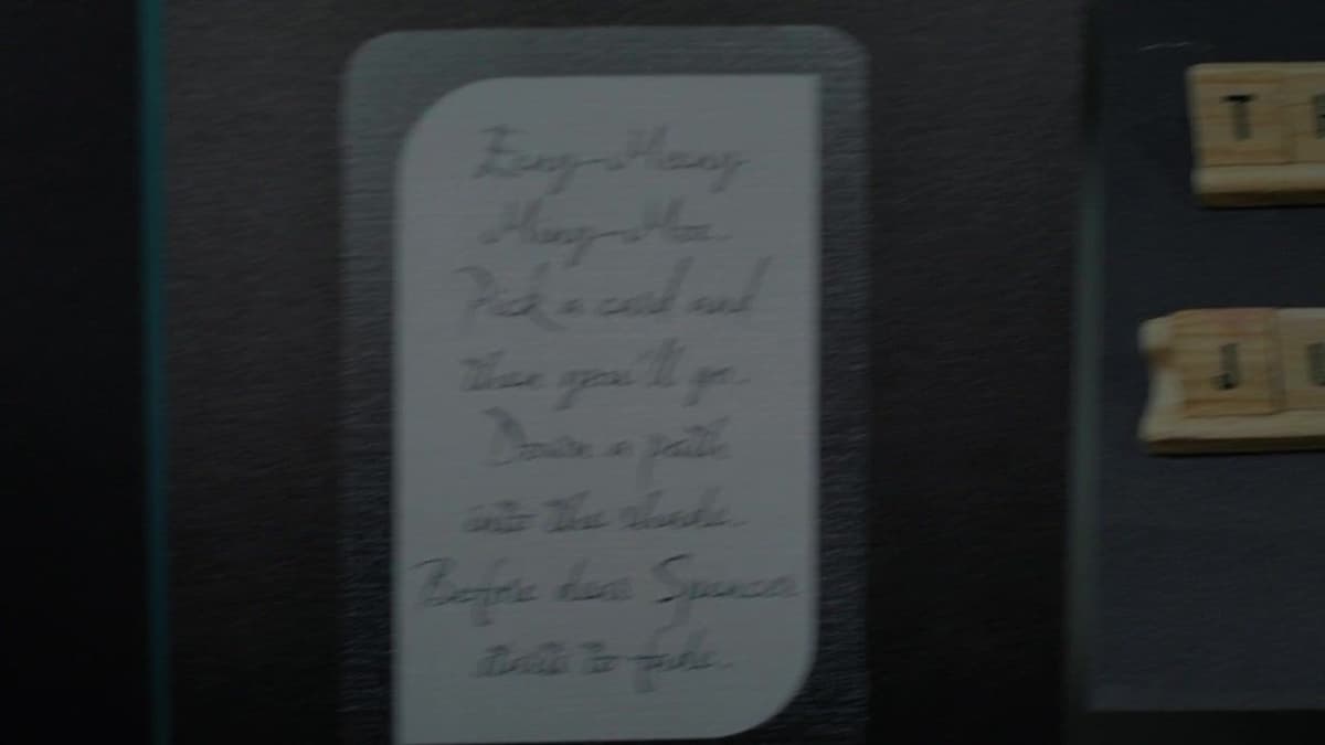
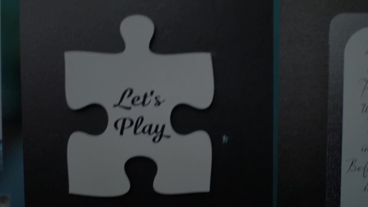
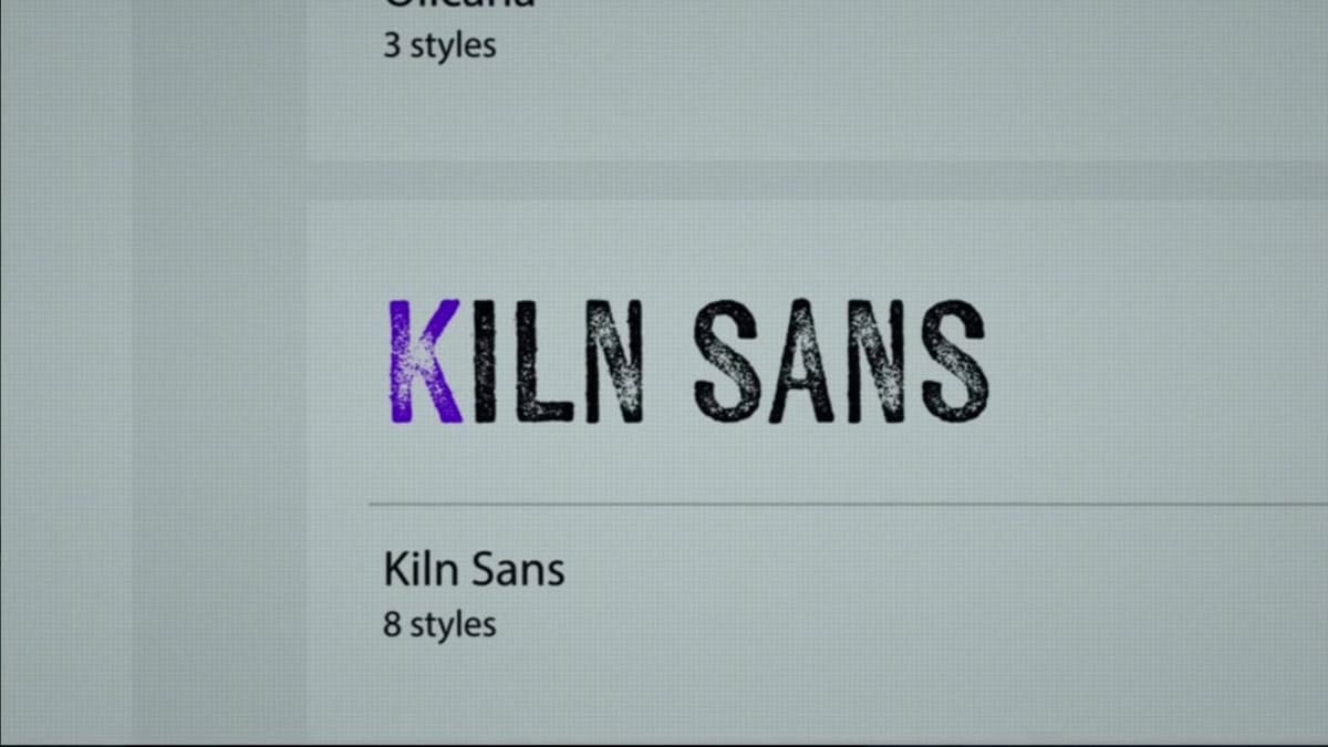
What if typography could be the means to solving a mystery? In one episode of the TV show High Potential, the protagonist Morgan Guillory, a cleaning woman who becomes a police consultant because of her high deductive skills, notices one small detail that turns out to be the breakthrough. The abductor they’re chasing is constantly leaving letters with different fonts, later identified as Romana, Haptic Script, Olicana, Kiln Sans, and Avant Garde. While showing the process of searching and identifying the fonts, the camera lingers a close-up on the computer screen, highlighting in different colours the first letter of each typeface name, maybe to visually suggest to the viewer the answer to the riddle. In fact, Morgan points out the link between each font and the first letter, an acrostic, which in turn gives “RHOKA.” Morgan sees this as the name of an architect, guiding them to a particular house he built in Encino. It is through typography that the investigation took a turn to bring the team to the right place and save Oz, who was kidnapped, and later discovered chained in a pool. Even if the computer screen is not a printed piece, the central role of the design clarity to catch the coloured letter was fundamental regardless. As a matter of fact, the starting point was the notes left by the abductor, which are indeed considered graphic props. This is a case where typography plays such a crucial role that it becomes integrated into the diegetic world, drawing attention within the scene and even featuring in the dialogue.