Typographic Business Cards
PROP
Ticket
FUNCTION
Causal, Thematic
DESIGNER
Unknown
MOVIE
American Psycho
YEAR
2000
DIRECTOR
Mary Harron
PRODUCTION DESIGNER
Gideon Ponte
GRAPHIC ARTISTS
Uncredited
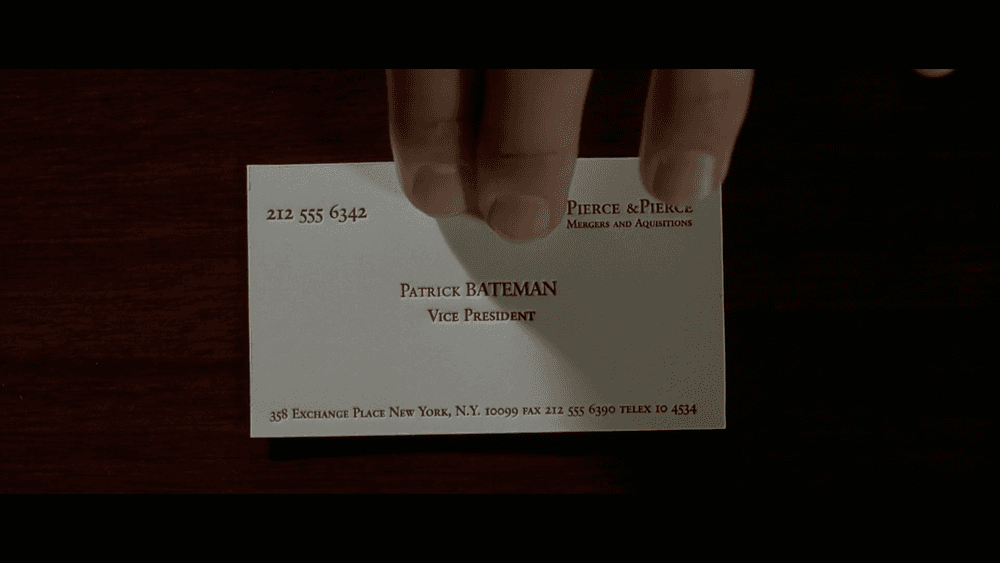
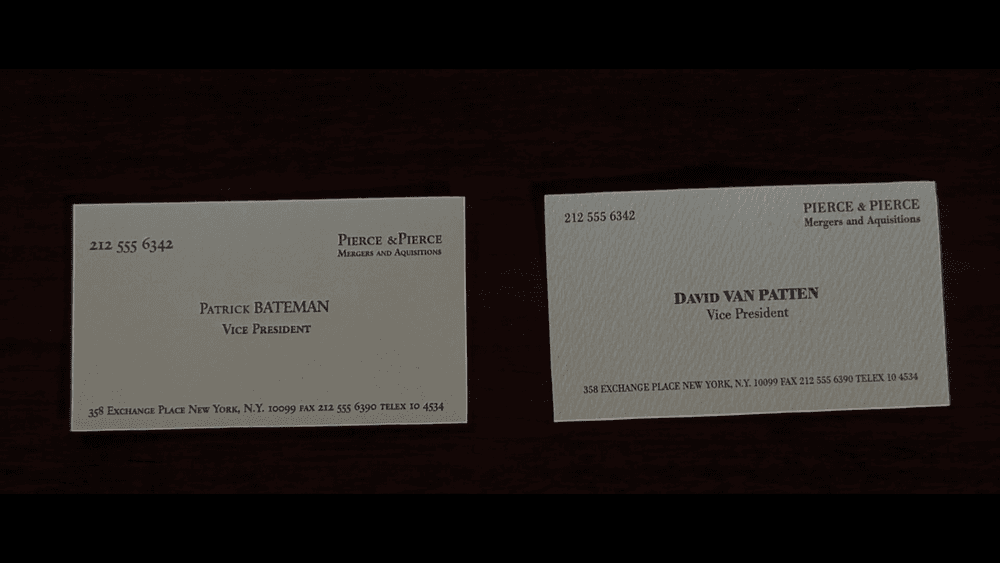
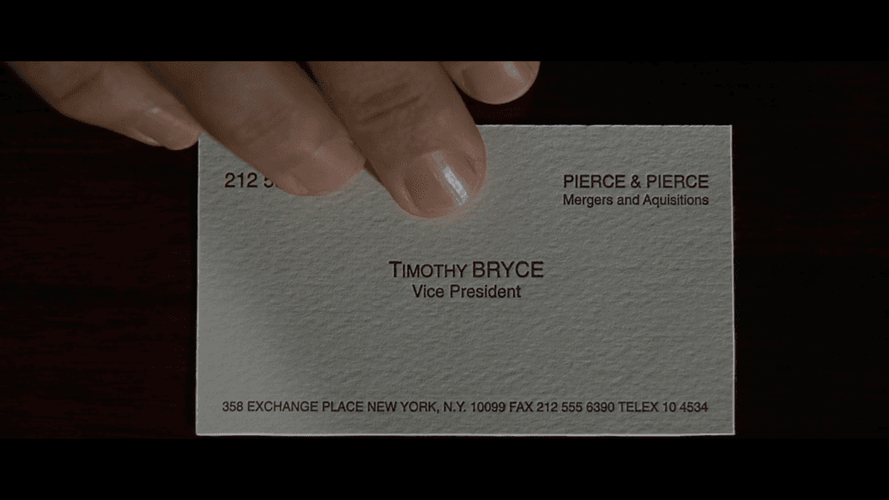
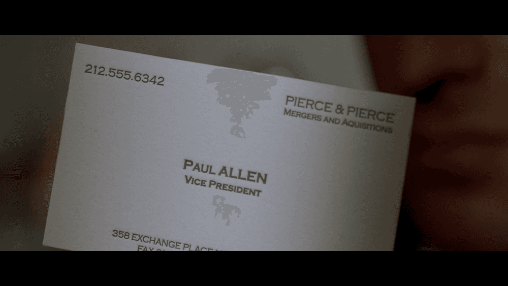
The colleagues are gathered around a conference table, comparing each other’s business cards, seemingly a mundane and trivial act. However, each card is the focus of extreme close-ups, followed by discussions and compliments about design details—like the subtly different shades of white of the paper, embossed lettering, and the presence of a watermark—treating them with reverent, almost erotic intensity. There is even a whole line of script centered in the type, “the lettering is something called Silian Rail,” a fictitious font created by the author of the original novel, Bret Easton Ellis. This reverent treatment loads the scene with masculine competition and obsession with superficial details to satirize 1980s yuppie culture, where identity is reduced to status symbols. For Bateman, the business cards trigger deep insecurity, exposing his fragile ego and obsession with image, when his colleague Paul Allen reveals a card more refined than his own. His fixation on surface details mirrors his need for control and masks his inner emptiness and violence. Thus, graphic props serve to carry out and help visualize these thematic implications at a deeper level of the story.


